Loading...
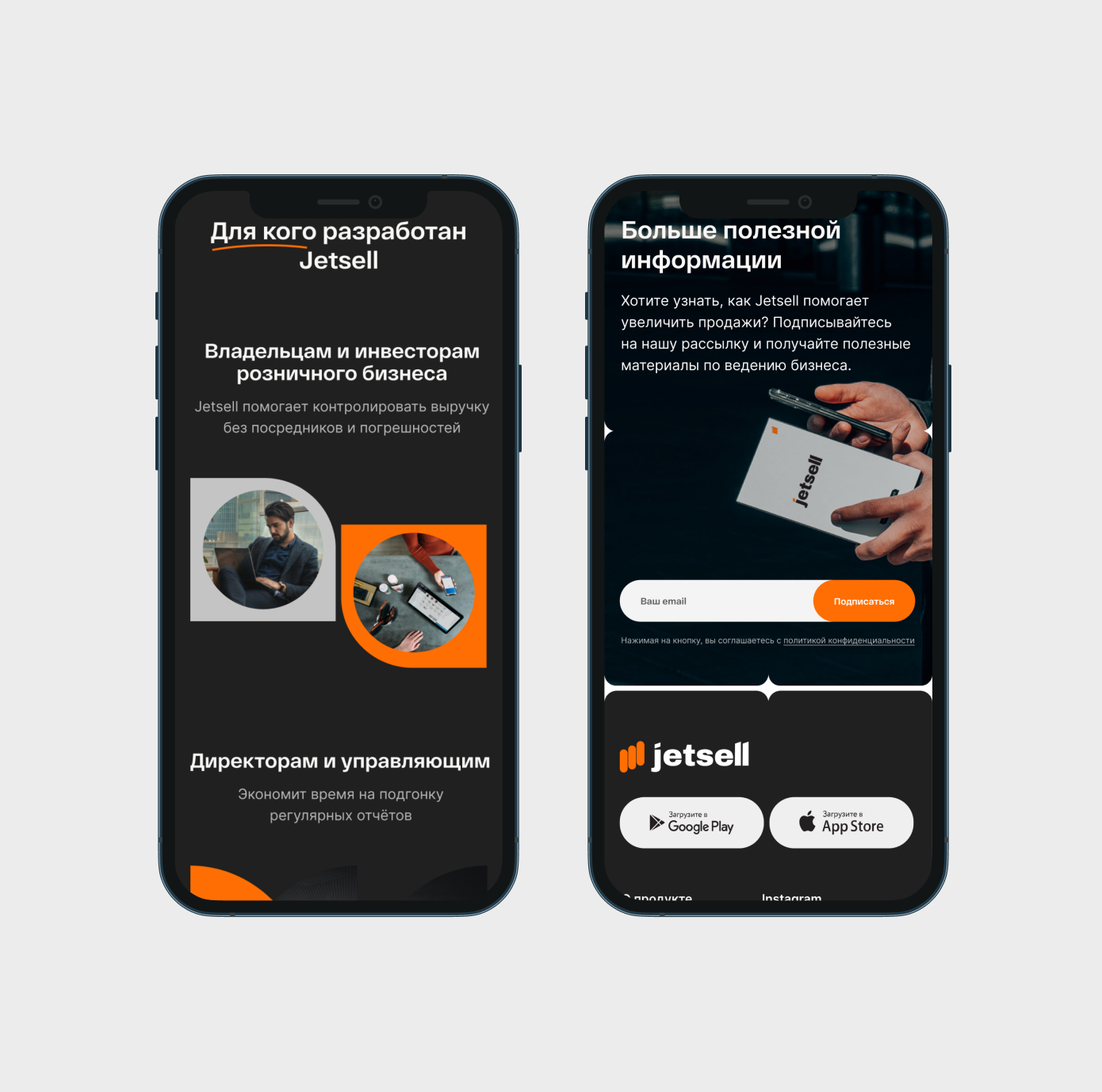
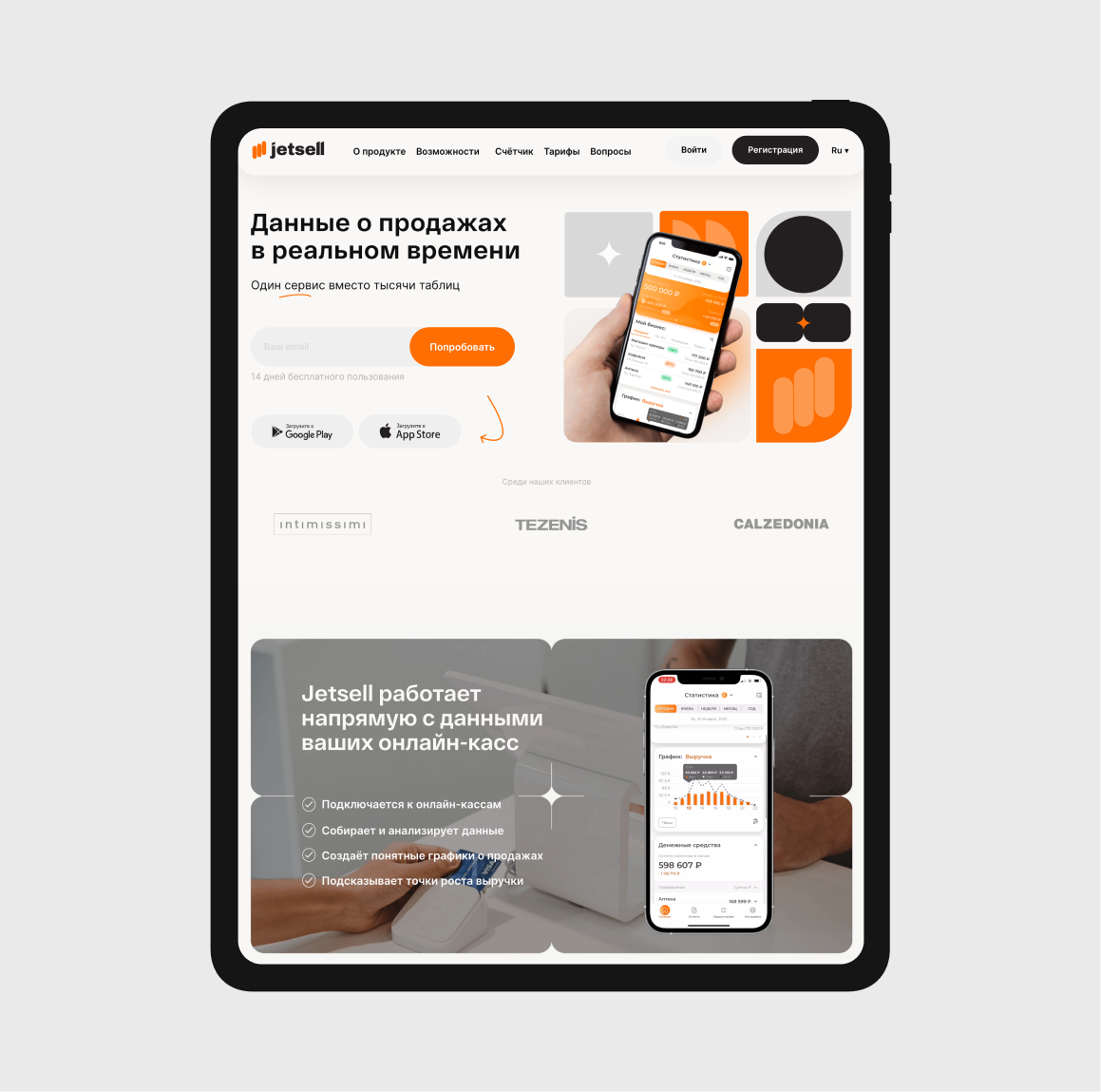
Jetsell is a service that helps to monitor the whole business using only one app instead of a thousand tables. All data sets are available online, besides the user-friendly interface helps quickly understand all reports.
Branding and website development for Jetsell mobile app
development
user experience
made on tilda
awards and mentions
copywriting
interface design
art direction
branding
services
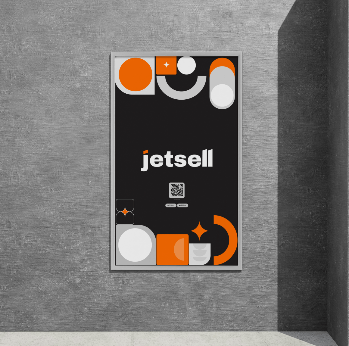
We created a corporate identity which was built on the unique shapes and colors. Further, according to the brand book, a landing was developed.
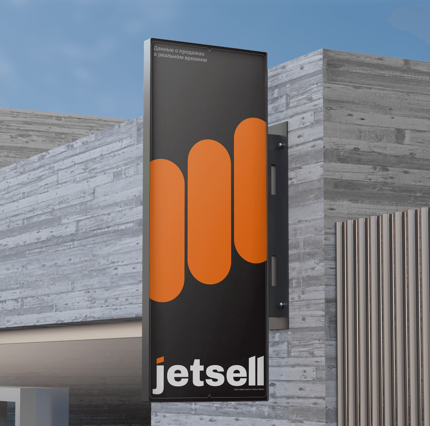
The logo metaphor is based on the image of the graph, namely the columns of the diagram. By connecting them together, we managed to reflect the main idea of Jetsell — an entire business is assembled in one application. Logo sign has a softness and friendly-shaped, however the wordmark was made in a stricter style to achieve balance. This contrast technique adds rhythm and confidence to the logo.
The logo metaphor is based on the image of the graph, namely the columns of the diagram. By connecting them together, we managed to reflect the main idea of Jetsell — an entire business is assembled in one application. Logo sign has a softness and friendly-shaped, however the wordmark was made in a stricter style to achieve balance. This contrast technique adds rhythm and confidence to the logo.