Loading...

The website development for Zebra Hero Films studio
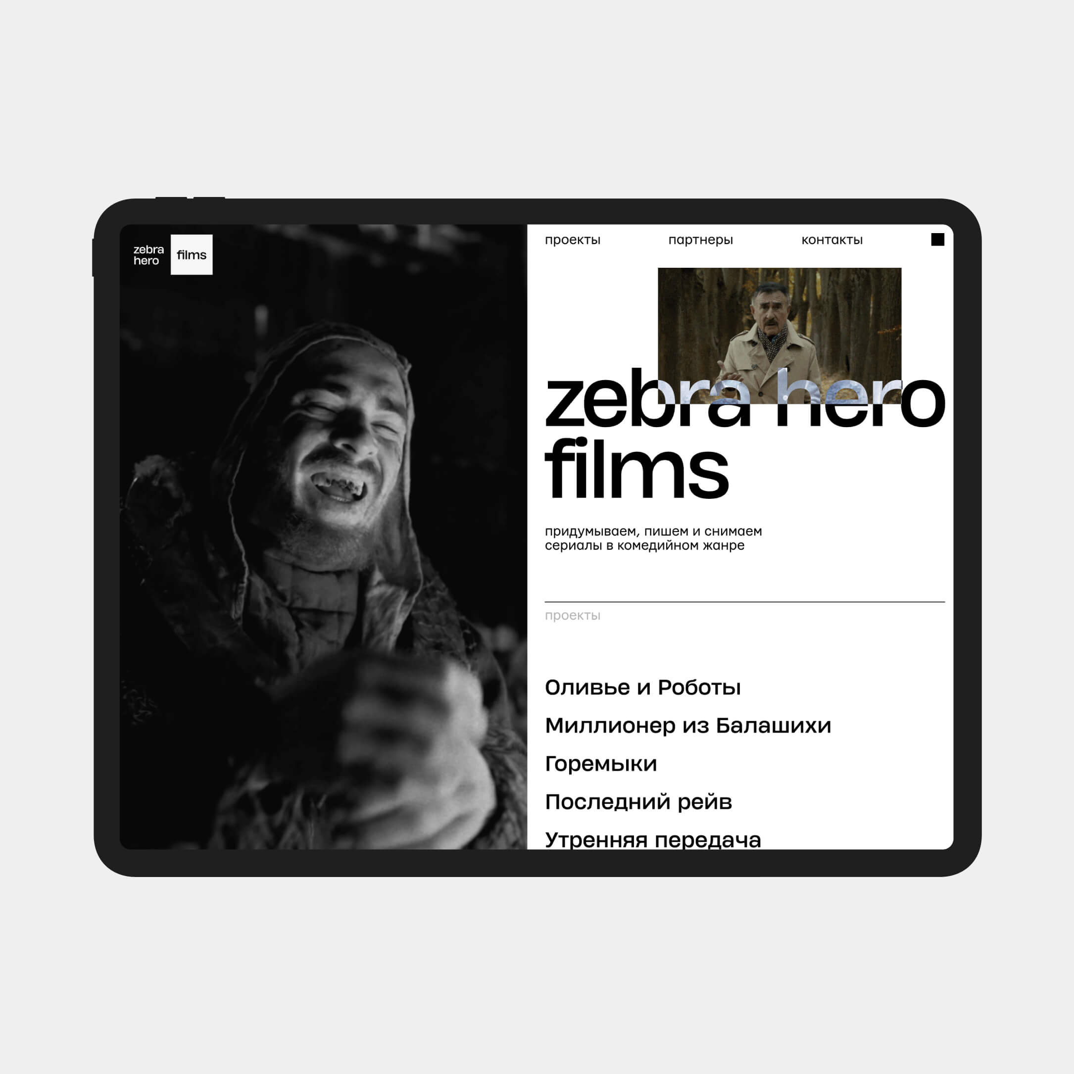
Zebra Hero Films is a project of the creative agency Zebra Hero. The film company creates, writes, and produces comedy series. For Zebra Hero Films, we created an image website-portfolio with the company's key works. The identity was previously developed by us as part of the agency's website.
services
art direction
user experience
interface design
development
The brand identity is based on the contrast of black and white, referring to the stripes of a zebra. To enhance this effect, we used the mix blend mode technique. Additionally, we added the option to switch between light and dark interfaces on the website's homepage. The main focus was on the studio's projects, with the screen divided into functional and content sections. The right side of the screen is fixed when scrolling and divides the page into blocks, while the left side displays project previews or remains blank.
We also created standard project pages that aim to showcase content in the form of videos, backstage photos, credits, and additional materials in detail.
We also created standard project pages that aim to showcase content in the form of videos, backstage photos, credits, and additional materials in detail.
